Your pricing page is the business end of your website, where all of your marketing investments come to fruition and culminate in a sale.
Small changes here have a huge impact in terms of sign-ups and MRR, so to help you improve your own pricing page, we're learning from the pricing strategies of two of the software world's biggest businesses.
Today, we're pitting two giants of marketing automation, HubSpot and Eloqua, in a head-to-head battle to determine whose pricing page reigns supreme.
Spoiler: you're about to see some seriously bad pricing.
1) Value Metric
ELOQUA
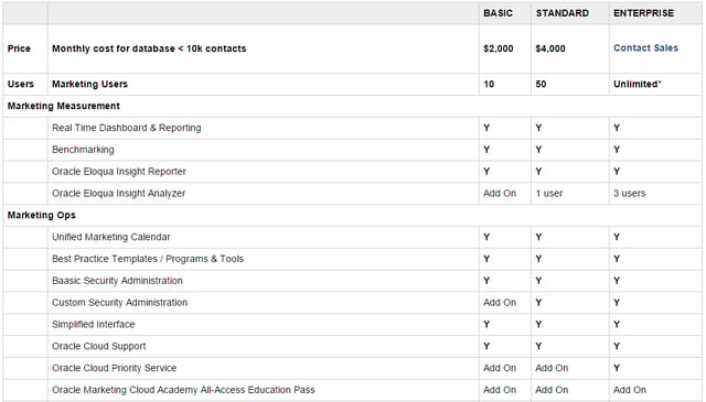
On the surface, Eloqua's primary value metric appears to be users: a metric which which provides limited value to the buyer, and actually limits the adoption of the software.
Closer inspection reveals that Eloqua also limits each package by the number of contacts in the buyer's database - with all of the pricing options shown only applicable to customers with less than 10k contacts. For companies with more than 10k, the entire pricing table becomes irrelevant.
As an added extra, individual features are also separately limited by number of users, making it near impossible to determine which metrics actually impact the cost, and which package is best suited to the buyer's needs.
HUBSPOT
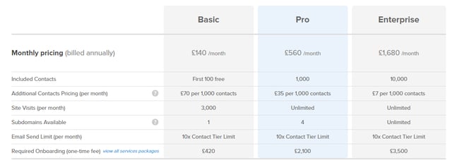
HubSpot are also guilty of adding in too many value metrics (the Basic package is particularly confusing - are we going to be limited by contacts, site visits or subdomains?)
However, there's a big difference: it's likely that most businesses will have a rough idea of their site visits, contact lists and subdomains. Armed with that information, it's easy for prospective buyers to work out which package they'll require, and how much it'll cost them.
2) Pricing Tiers
ELOQUA
At first glance, Eloqua's pricing tiers look straightforward: a $2,000 Basic package, $4,000 Standard package, and a custom quote for Enterprise packages.
However, the prices offered for the Basic and Standard tiers only apply to users with less than 10k contacts. They also don't include the cost of Eloqua's 12 optional add-on features.
There's no clear indication of the contents of each package, or its real-world price. In practical terms, all three of pricing tiers amount to the same thing: $Actual Price on Request.
HUBSPOT
To levvy some criticism at HubSpot, the Basic package is limited in a ton of potentially needless ways (perhaps the result of specific abuse cases), and they could probably do more to extract value from their enterprise clients (unlimited anything for a huge enterprise organisation is pretty generous).
Overall though, HubSpot's three packages are clearly delineated, cover a broad range of price points (compare HubSpot's minimum $200/m with Eloqua's $2,000/m), and make it quick and easy for prospective buyers to calculate which package they'd need, and how much it'd likely cost.
3) Feature List
Eloqua
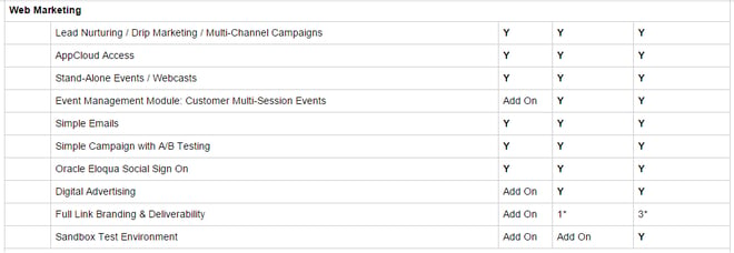
Eloqua's packages boast a ton of features, functionality and add-ons, none of which I understand.
Advanced Data Cleansing? Oracle Eloqua Engage? Digital Body Language?
I'm a fairly savvy marketing dude, and I don't understand a full 50% of the features listed here. Without any context, I don't understand what these features do, or how they could benefit me - so why would I want to pay for them?
Almost every feature is available in almost every package, assuming we're willing to pay extra. The question is, would it be cheaper to buy a basic package and a few add-ons? Or would we be better served by a premium package?
I have literally no idea.
HubSpot
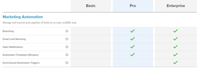
HubSpot have a laundry list of features too, but unlike Eloqua, each item has a tooltip that offers a clear, concise and value-focused explanation of the feature. In other words, I dont have to work to see the value in their features.
The use of a persistent header makes it easy to refer back to the different pricing packages, and the clear tick/no tick system is tons easier to navigate than Eloqua's Yes/Yes-if-you-want-to-pay-extra system.
4) Design
ELOQUA
Did somebody say 'Microsoft Excel'?
All content, be it copy, diagram or pricing table, exists in the context of the page it's on. The design and useability of that page are just as important as the content it contains - something which Eloqua, and their 1990's-style spreadsheet, haven't managed to grasp.
The design and UI of your website also implies a lot about the software you create. Looking at Eloqua's pricing page, tell me: would you buy software that looked like that?
HUBSPOT
HubSpot's pricing page isn't a masterpiece, but it at least looks like it was created by a web designer, instead of a data analyst.
Color contrast is used to guide the eye to crucial information and CTAs, and extra information is hidden behind an expandable section - massively improving the readability for casual visitors.
UI and UX have clearly been considered, and crucially, the page reflects well on the useability of the software HubSpot create.
5) Call to Action
ELOQUA
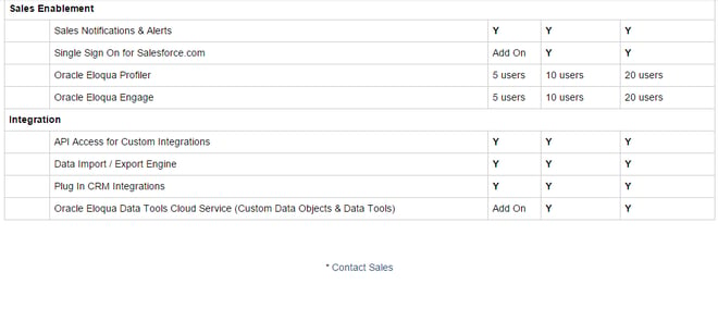
Let's play Find the CTA!
Your pricing page is the business end of your website, designed to help visitors identify the right package, and encourage them to move further through the sales funnel.
With that in mind, why would you choose to hide the crucial 'Next Step' of your pricing page? Instead of offering a free trial button, or even a demo, Eloqua have opted for a plain-text link to a generic contact form.
Easily missed, no personalisation and no benefit to the buyer, and doubtless a minuscule conversion rate as a result.
HUBSPOT
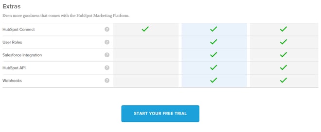
In contrast, HubSpot offer a clear, low-commitment call-to-action: a self-service free trial.
The CTA repeats at key points on the page, and uses a colour reserved exclusively for the free trial offer. The Try/Buy buttons could be simplified, but overall, there's a very clear next-step for prospective buyers to take.
Final Verdict
ELOQUA
The Eloqua pricing page isn't a pricing page.
It's difficult to compare features across different tiers. It's impossible to compare pricing.
Worse still, it looks like Eloqua are intentionally obfuscating importants bits of information, forcing all prospective buyers to talk to a sales rep to get any kind of meaningful insight - sales reps who are incentivised to sell as much as possible.
If you have to talk to a rep to discover the price of a package, what's the point in a pricing page?
Instead of helping people choose the right package for their needs, and explaining the cost of doing so, the only message Eloqua broadcasts to visitors is to say 'Don't have £2k for an Eloqua license? Don't waste our time talking to a sales rep.'
HUBSPOT
The HubSpot pricing page is far from perfect, but they've still made some smart decisions:
- Clear pricing
- Clearly differentiated packages
- Easy-to-understand format
- Designed to drive prospective buyers further into the sales funnel
Unlike Eloqua, I'd also expect HubSpot to continually test and improve their pricing page, moving further towards a sweet-spot for both business and customers.
In short, your pricing page has a big impact on your business, and you can choose to approach it as either a HubSpot or an Eloqua.
You can decide to constantly experiment, test and re-evaluate your pricing; or you can create the world's least useful Excel document, and send your bewildered visitors straight into the clutches of hungry sales people.
In the words of Will, our CEO:
"Don't do anything Eloqua have done."


