
Whether you're trying to turn visitors into leads, or leads into free trials, you have one shot to encourage that all-important click.
Discover how to convert more contacts, leads, trial users and customers, with 17 actionable steps you can take to create a SaaS landing page that converts.
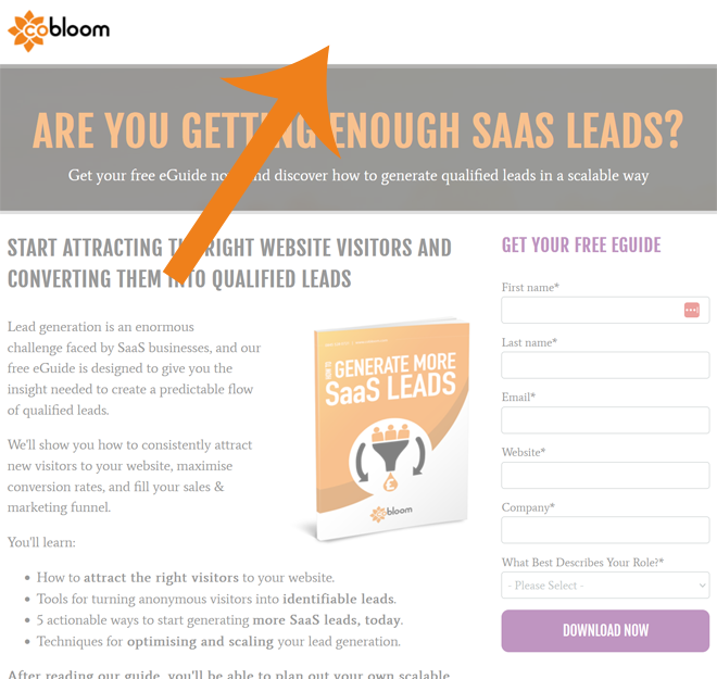
1) Find the Fold
Website visitors don't like to scroll, spending 80% of their time above the page fold. To maximise conversions, the most important parts of your SaaS landing page (headline, hero image, persuasive copy and contact form) need to be visible as soon as the page loads.
Want to find out where your fold is on multiple devices? Check out Where is the Fold?
2) Maintain Consistency in Your Language
To get to a landing page, most visitors will click on some kind of call-to-action (CTA). To prevent visitors from clicking the dreaded 'Back' button, it's important for your SaaS landing page to be aligned with the CTA you use. That means using the same language, style and design wherever possible.
For example, if your CTA says "start your free trial", make sure that it also says "start your free trial" at the bottom of your form, so a visitor knows that they've reached the right page and are getting what they expected by reading on and filling the form.
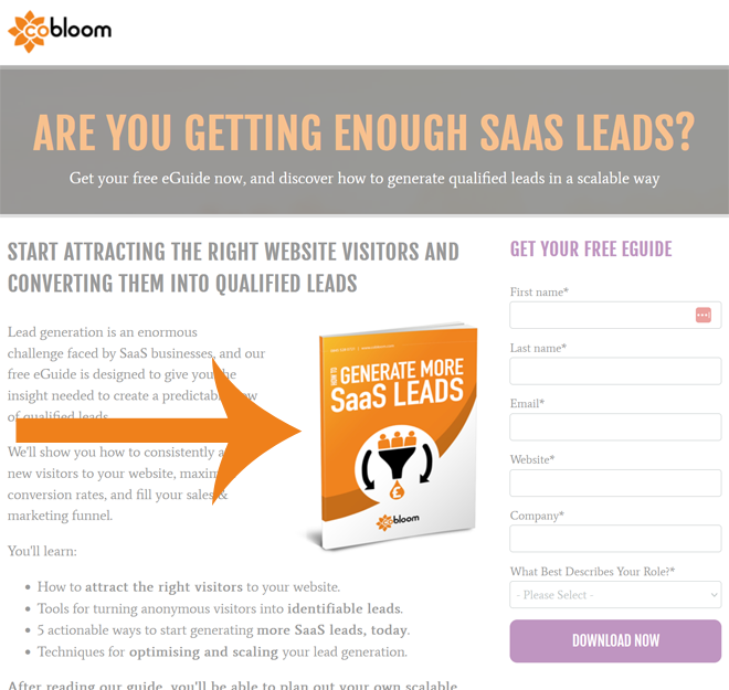
3) Use a Hero Image
A picture is worth a thousand words, and a hero image (a photo of your landing page offer) will help your visitors visualise, want and download your landing page offer. It also helps avoid the dreaded wall of text (a.k.a TL;DR) syndrome:
4) Incorporate Social Proof
Landing pages can feel risky, with visitors sometimes parting with personal information, only to receive nothing of value in return. Thankfully, you can use social proof to help assuage these feelings of doubt - using customer images, testimonials and data to prove that your landing page offer really is as good as it sounds.
See this example, from HubSpot, on their free trial landing page:
5) Ditch Stock Photos
Stock photos are increasingly associated with cheap adverts and dodgy websites, and using them can undermine the legitimacy of your social proof. Try to avoid using them where you can, especially when the stock photos are just people looking at computer screens, etc.
Instead of stock photos, use real-world photos of your actual customers, clients. If your landing page is promoting a free trial or demo of your product, show off the product with screenshots or even a quick video overview.
6) List Benefits, Not Features
Instead of detailing your app's new real time editing feature, or your ebook's 35 chapter titles, try to position benefits instead. People care about what they'll gain, and much less so all the features of what they engage with.
If it's an eGuide, tell the reader what they'll learn by the end of it, and how that will help them:
If it's a free trial of your product, explain how using it will help them to make their job easier, for example.
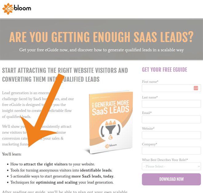
7) Bullet Point Benefits
When you need to get a point across, quickly and effectively, you can't beat the humble bullet point. They're short, easy to read, and easy to remember - and they're perfect for focusing your visitor's mind on the reasons they need your landing page offer.
Bullet points are another great tool for helping you avoid "wall of text" syndrome.
8) Use Actionable Language
Landing pages are designed to encourage visitors to submit your contact form, so it's important to use actionable language to reinforce the concept of taking action. Avoid passive words, and replace weak sentences with strong, direct phrases like 'Download now'.
9) Use F-Shaped Content
English text is written and read from left-to-right (known as sinistrodextral text). This creates a left side preference among readers, causing website visitors to spend 69% of their time looking at the text on the left side of the page.
So, to maximise the amount of persuasive copy your visitors engage with, make sure that the left side of your page is reserved for persuasive sales copy and compelling benefit lists.
There's a good reason most high performing landing pages have text on the left, and forms on the right!
10) Avoid Banner Blindness
Website visitors are getting increasingly good at identifying and ignoring adverts - so good that any landing page that looks like an advert will be instinctively ignored.
This is known as banner blindness, and can be avoided by ditching the use of banners, stock images and other ad-related design elements.
11) Remove Navigation Links
A navigation bar is vital for helping visitors explore your website: but on a landing page, they're an unnecessary distraction. To improve conversation rates, strip down your navigation bar, and leave a simple homepage logo or back button.
12) Include Social Share Buttons
If your visitor likes your offer enough to download it, chances are they'll have a friend or colleague who'd feel the same way. Leverage this by offering social share buttons, and making it easy to share the landing page offer to Twitter or LinkedIn.
13) K.I.S.S.
Landing pages set out to achieve a single goal, so it's important to keep the design, messaging and layout as simple as possible, with every element designed to serve that goal - getting your user to submit the contact form.
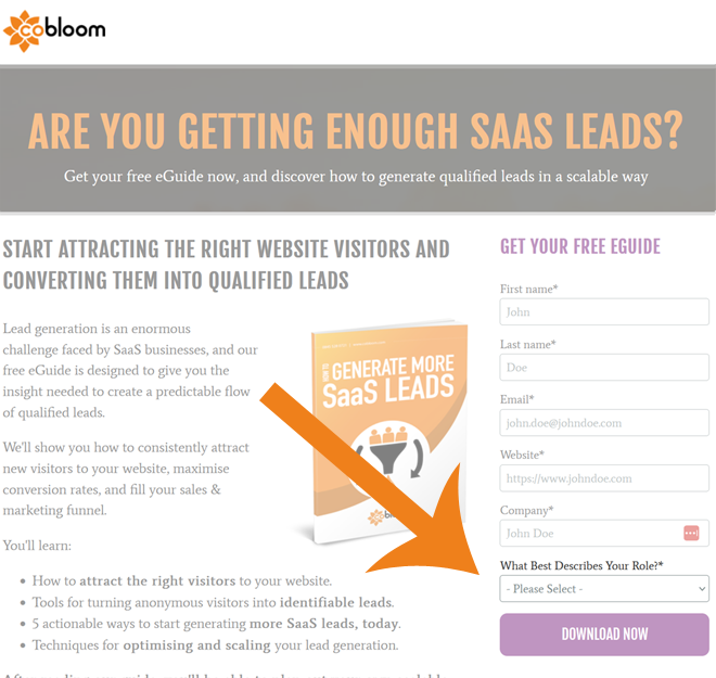
14) Balance Risk with Reward
People don't like to part with personal information, and for most forms, the more information you ask from a landing page visitor, the lower your conversion rates will be. It's therefore important that you only ask questions which are essential to improve the lead's experience after submission.
Wherever possible, minimise the number of form fields required to submit the form - and when you ask for a lot of information, offer something particularly valuable to your visitor in return.
15) Use Smart Fields
If a visitor is already in your marketing database, a Smart Field will automatically adjust to ask for new information. This makes it easy to build-up a more complete picture of your contacts, without asking for the same information over and over again.
16) Write Smart Button Copy
Your use of benefit focused copy should extend to your contact form button. Instead of using words like 'Submit', opt for something more appealing and urgent - like 'Get Weekly Marketing Advice', or 'Unlock 20 SaaS Conversion Secrets Now'.
17) Leverage Colour Contrast
Remember that 'create congruence' rule from earlier? There's an exception to that: the submit button. The use of a contrasting colour (like red on an all-blue website) will draw attention to the button, and help encourage that all-important click.

